Project Electric - Home services marketing
A modern look for an electrical company
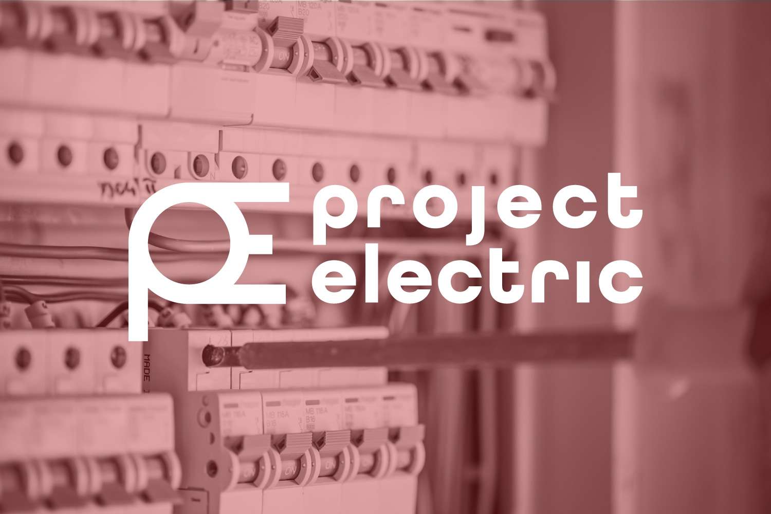
A great logo has to be memorable, attractive, and distinct. Leveraging mid-century European design and iconography from electrical diagrams, we built Project Electric a logo that looks great everywhere.
Truly inspired logo design for a local electrical company
Project Electric is a Canadian electrical contractor focused on specialized commercial and residential projects such as theatre installations and building automation. They came to us looking for a brand refresh that spoke to their commitment to innovation and quality. We were inspired by mid-century minimalist art movements and iconography found in electrical diagrams, resulting in a clean and visually intriguing brand that looks great on everything from vans to construction site signage.

Challenge
Project Electric’s brand before the refresh had no stories to tell. Consisting of a simple wordmark in an industrial-style font, the logo blended in with its competitors. The client wanted to demonstrate their specialization and creativity with a brand refresh. They asked us to help them push their brand further in a way that reflected their industry but looked completely distinct.
Solution
First, we got conceptual. We explored the electrical industry, looking for visual elements that might be adapted into an interesting logo. We found that many symbols on electrical diagrams could be adapted to a wordmark. One that stood out to us was the symbol for electrical outlets. It contained shapes and lines that could be modified to spell out the initials of Project Electric. We blended this symbol with inspiration from mid-century art and architecture to produce a truly special brand.
Results
The fact that it is still one of the agency’s favourite branding project, nearly 5 years after completion, says a lot. The brand has a timeless feel to it, allowing it to stand outside of trends and doesn’t require constant updates to it to keep it relevant. The client has shared with us on numerous occasions that the company gets more recognized now, and people express how much they like the branding. Relevance, timelessness, and alignment. What more could we want for a successful branding exercise?

Brand backed by trust.
“[The team at BlackBean] are the best! They created our company brand and did marketing for us. I would highly recommend this professional team to make your business shine.” – J. Bojey, Owner